Color Theory Unlocked: The Art & Science of Your Photo Vibe ✨
Forget the textbooks—color theory is your secret weapon for crafting truly iconic images. It’s not about rigid rules; it’s an emotional toolkit, helping you dial in the exact mood and story you want to tell. Master this, and those worries about over-saturation? Gone. You’ll be creating stunning, professional-level vibes effortlessly. 🎨
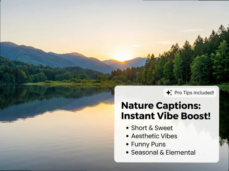
Quick Vibe Check: Your 10-Second Color Boost ⚡
- Color is pure emotion: Learn to ‘speak’ its language to tell deeper stories.
- Schemes are your secret sauce: Complementary for drama, analogous for chill, monochromatic for luxe depth.
- Editing is your final glow-up: Refine hues, saturation, and balance to perfect your vision.
The Core Palette: Breaking Down Color Basics 🎨
Before you can craft a mood, you need to know your building blocks. The color wheel isn’t just a pretty circle; it’s your fundamental map for intentionally evoking emotion and harmony. Master these basics, and you’re ready to compose visual stories that genuinely resonate. 🌟
Your Color Palette Blueprint: Primary, Secondary & Tertiary Hues 🌟
- **Primary Colors**: The absolute OGs of color (Red, Blue, Yellow). You can’t mix these, they’re the pure foundation of every vibe. ✨
- **Secondary Colors**: These are your next-level mixes. Combine two primaries, and boom: Green (Blue + Yellow), Orange (Red + Yellow), Purple (Red + Blue). 🧡💜💚
- **Tertiary Colors**: The sophisticated blends. Mix a primary with an adjacent secondary on the wheel. Think Red-Orange, Yellow-Green, or Blue-Violet. They add nuance! (o´▽`o)
- **Red**: A primary, bringing energy, passion, or drama. A powerful statement color in any shot. ❤️🔥
- **Blue**: A primary, often setting a calm, cool, or even melancholic mood. Think serene skies. 💙
- **Yellow**: A primary, radiating warmth, happiness, or vibrant energy. Instant sunshine in a frame. 💛
The Vibe: It’s easy to just ‘see’ colors, but mastering them means *isolating* them. This isn’t about luck; it’s about intentional training.
The Play: Start treating your daily strolls like a live photoshoot. Pick a color scheme (e.g., analogous greens and blues, or complementary orange and teal) and consciously hunt for it. Notice how light changes a hue, or how a pop of red against a muted background instantly grabs attention. Snap mental pictures, or actual ones with your phone. The more you practice seeing color relationships, the more naturally they’ll appear in your compositions. It’s like a glow-up for your visual perception! ✨
Vibe Check: Complementary & Analogous Color Power 💖
Ready to level up your emotional storytelling? Complementary and analogous schemes are your go-to. Use complementary pairs to create striking visual drama and make elements *pop*, or lean into analogous colors for a serene, unified harmony. These aren’t just techniques; they’re direct levers for shaping the emotional tone and narrative of every single shot. 📸
Drama & Pop: Mastering Complementary Color Pairings 💥
- **Blue & Orange**: The classic power duo! Think vibrant orange sunsets against a deep blue sky for instant visual drama and pop. 🌅💙
- **Red & Green**: Creates intense contrast, perfect for making subjects like a red apple in a green field truly jump out. 🍎🌿
- **Cool & Warm Combos**: Pairing a cool background (like blue) with a warm subject (like orange donuts) makes the main subject *pop* with delicious impact. (๑>ᴗ<๑)
- **Pink & Green**: In a watermelon radish bowl, a warm pink against a cooler green creates striking contrast, making the pink elements vibrant and eye-catching. 🍉✨
- **High Contrast Vibes**: These opposite pairs on the color wheel are your secret for making elements stand out and grab immediate attention. 👀
- **Visual Interest**: Using complementary colors isn’t just about pop; it’s about guiding the viewer’s eye and creating compelling compositions. ➡️
Seamless Vibes: Crafting Harmony with Analogous Colors 🌿
- **Adjacent Hues**: Analogous schemes use colors next to each other on the color wheel, creating a naturally smooth and unified feel. Think effortless flow. 🌊
- **Blue, Blue-Green, Green**: A classic analogous trio for serene, cohesive images, perfect for tranquil nature shots or peaceful portraits. 💚💙
- **Red, Orange, Yellow**: Captures warm, invigorating feelings, like the natural progression of colors in heirloom tomatoes or stewed rhubarb. 🍅🧡💛
- **Kiwi & Mint Pavlova**: Pairing green kiwi with a blue background creates a crisp, refreshing vibe, proving how well adjacent colors can work. (´。• ω •。`)
- **Rhubarb & Its Hues**: A shot featuring pinks, reds, oranges, and yellows from stewed rhubarb showcases a vibrant, invigorating seasonal feel. 💖🧡
- **Seamless Blends**: These schemes help you achieve harmony where colors blend without jarring contrasts, creating a visually soothing experience. 🧘♀️
After posting a photo with a deliberate complementary or analogous color scheme, ask your audience to describe their immediate emotional response. This taps into subjective experience, driving authentic comments and boosting engagement.
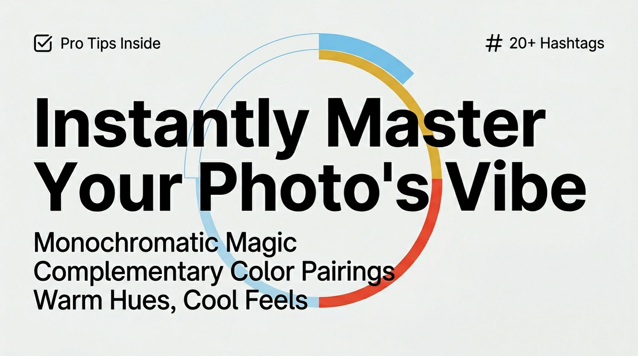
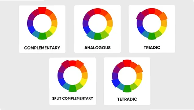
Beyond the Basics: Monochromatic, Triadic & Tetradic Palettes 💎
Ready for some next-level color play? Monochromatic schemes bring sophisticated unity and emotional depth with subtle shifts in a single hue. Then, triadic and tetradic palettes crank up the dynamic balance and vibrant energy. These tools offer limitless ways to tell nuanced stories and make your visuals truly pop. 🚀
Monochromatic Magic: Depth & Unity with a Single Hue ☁️
- **Single-Color Sophistication**: Monochromatic schemes use variations (tones, shades) of just one color to create rich depth and texture. Think minimalist luxury. ✨
- **Green Pear Still Life**: Different shades of green in a pear, leaf, and background create a vibrant yet unified shot. It proves one color can be incredibly dynamic. 🍐🌿
- **Warm Golden Pears**: Cooking pears in an upside-down chocolate cake shifts their monochromatic green to a warm, energizing golden feeling, all from a single hue’s variations. 🍮🧡
- **Visual Harmony**: By focusing on one color’s nuances, you eliminate visual clutter and achieve a deeply cohesive, pleasing aesthetic. (´• ᴗ •`)
- **Emotional Resonance**: Subtly shifting tones within a single color can evoke powerful emotions without needing a complex palette. It’s understated impact. 💫
- **Simplified Depth**: Don’t overcomplicate things; monochromatic palettes show how different shades of one color can work wonders for depth and visual interest. 🖼️
Dynamic Energy: Triadic & Tetradic Color Power ⚡
- **Triadic Schemes**: These use three colors evenly spaced around the color wheel, creating vibrant and balanced compositions with a playful energy. 🌈✨
- **Tetradic Schemes**: Also known as a double-complementary scheme, it uses two complementary pairs, resulting in rich, complex, and dynamic visuals. It’s advanced color play! (づ。◕‿‿◕。)づ
- **Vibrant Balance**: Both triadic and tetradic palettes introduce a lively, energetic feel while maintaining visual balance, making your photos engaging and eye-catching. 💖
- **Complex Visual Interest**: These schemes offer a sophisticated way to add multiple layers of color without overwhelming the viewer, perfect for intricate scenes. 🖼️
Warm Hues, Cool Feels: Mastering Color Temperature & Mood 🌡️
Color temperature is a direct line to your viewer’s emotions. Warm tones instantly convey energy and comfort, while cool tones bring calm or introspection. Understanding this gives you precise control over the psychological impact of every image, shaping its narrative depth and how your audience truly feels about your work. It’s a game-changer for mood-setting. ☀️❄️
Mood Makers: The Emotional Power of Warm & Cool Hues 💖
- **Warmth & Energy**: Reds, oranges, and yellows are your go-to for evoking feelings of energy, passion, and excitement. Think dynamic, vibrant scenes. ❤️🔥🧡💛
- **Calm & Relaxation**: Blues, greens, and purples bring a sense of tranquility, calm, and even introspection. Perfect for serene, peaceful images. 💙💚💜
- **Dynamic Scenes**: Warm colors inject vibrancy and activity, making your images feel alive and full of motion. 🚀
- **Peaceful Images**: Cool colors are ideal for crafting quiet, contemplative scenes that invite a sense of peace. 🧘♀️
- **Mood Setting**: Intentional use of color temperature gives you direct control over the atmosphere you want to create in every shot. 🌡️
- **Excitement**: Red and orange hues are inherently tied to feelings of excitement and heightened emotion. Use them to make a statement. (〃^▽^〃)
- **Tranquility**: Blue and green tones naturally convey a sense of stillness and peacefulness, ideal for calming visuals. ☁️
- **Vibrancy**: Warm colors add an undeniable zest and liveliness to your photographs. 🌟
Digital Glow-Up: Post-Processing for Next-Level Color 💻
Your camera captures the light, but post-processing is where your color theory truly shines. It’s crucial for refining every hue, allowing you to sculpt that vibrant ‘color pop’ or dial in sophisticated ‘subtlety’ with artistic precision. Software tools aren’t just for fixing; they’re for transforming your vision into a polished masterpiece. 💡
Your Editing Toolkit: Mastering Color in Post-Production 🛠️
- **White Balance First**: Always start here! Ensure your whites are *true* white to balance all other colors naturally. Use presets or manual sliders. ⚪
- **Correct Exposure**: Get your light levels right. Proper exposure is foundational for accurate color representation and a clean base. 💡
- **Adjust Contrast**: Define the light and dark areas. Contrast helps your colors pop and adds visual depth. ⚫️⚪️
- **Saturation vs. Vibrance**: Use Vibrance for a natural boost (it protects skin tones), and Saturation for an all-out color *pop*. Know the difference! 🌈 vs. ✨
- **Hue Adjustments**: Shift specific colors on the wheel. Turn a blue into a teal or purple to match your artistic vision. 🎨
- **Luminance Control**: Alter the brightness of individual colors. Make specific reds brighter or greens darker to guide the eye. 🌟
- **Selective Color**: Target specific hues without affecting the whole image. Boost only the blues in a sky or greens in foliage. 🎯
- **Masks & Layers**: Apply adjustments to *only* certain parts of your image for precise, complex edits. No global changes needed. (ノ◕ヮ◕)ノ*:・゚✧
- **Color Grading Styles**: Experiment with cinematic looks like the ‘teal and orange’ for drama and mood. 🎬
- **Presets & LUTs**: Speed up your workflow and achieve consistent looks with predefined color adjustments. They’re your quick-edit secret weapon. 🚀
- **ON1 Photo RAW**: Utilize advanced tools for selective hue, saturation, and luminance adjustments for ultimate control. 💻
The Vibe: It’s a common mistake to just crank up ‘Saturation’ for more color. But knowing the difference between ‘Saturation’ and ‘Vibrance’ is key to a polished, professional look.
The Play: Think of **Vibrance** as your smart color booster. It selectively increases the intensity of *less saturated* colors, leaving already vibrant hues (like skin tones!) untouched. Use this for a natural, subtle glow-up. When you want an all-out, dramatic **pop** across *all* colors, that’s when you gently reach for Saturation. But be warned: overdoing Saturation can quickly make skin look unnatural and your image feel artificial. Always start with Vibrance for a more refined, authentic color enhancement. Your portraits will thank you! 💖
Words in Color: Inspiring Photography Philosophies 💭
Sometimes, the perfect words elevate your vision even further. Here’s a curated collection of powerful insights from legendary photographers and thinkers. These quotes capture the very essence and transformative power of color in visual storytelling, sparking deeper reflection and fueling your artistic growth. Get ready to be inspired. ✨
Editor’s Top Picks: Color & Vision 🌟
“One very important difference between color and monochromatic photography is this: in black and white you suggest; in color you state. Much can be implied by suggestion, but statement demands certainty… absolute certainty.” – Paul Outerbridge
“Color is very much about atmosphere and emotion and the feel of a place.” – Alex Webb
“Great photography is about depth of feeling, not depth of field.” – Peter Adams
Inspire Your Lens: Quotes on Color & Vision 🌈
- “In black and white you suggest; in color you state.” – Paul Outerbridge ✨
- “I wanted to see a lot of things in color because the world is in color.” – William Eggleston 🌍
- “Color is very much about atmosphere and emotion and the feel of a place.” – Alex Webb 💖
- “In my photography, color and composition are inseparable. I see in color.” – Anonymous 👁️
- “Photography takes an instant out of time, altering life by holding it still.” – Dorothea Lange ⏳
- “Composition is important, but so are many other things, from content to the way colours work with or against each other.” – William Eggleston (´• ᴗ •`)
- “Black and white can show how something is. Color adds how it is, imbued with temperatures and humidities of experience.” – Peter Schjeldahl 🎨
- “Great photography is about depth of feeling, not depth of field.” – Peter Adams 💫
- “I really believe there are things nobody would see if I didn’t photograph them.” – Diane Arbus 📸
- “One should really use the camera as though tomorrow you’d be stricken blind.” – Dorothy Lange 🙏
- “To me, photography is an art of observation.” – Elliott Erwitt 👀
- “What I like about photographs, is that they capture a moment that’s gone forever.” – Karl Lagerfeld 🌟
- “A camera is a tool for learning how to see without a camera.” – Dorothea Lange 🧠
- “Photography is an itch I can’t scratch.” – Don McCullin 🐾
- “A camera is a SAVE button for the mind’s eye.” – Roger Kingston 💾
- “Light makes photography.” – George Eastman 💡
- “To photograph is to hold one’s breath.” – Henri Cartier-Bresson 🌬️
- “My life is shaped by the urgent need to wander and observe.” – Vivian Maier 🚶♀️
- “Taking pictures is savoring life intensely.” – Marc Riboud 🥂
- “Color tends to corrupt photography and absolute color corrupts it absolutely.” – Anonymous 😈
One very important difference between color and monochromatic photography is this: in black and white you suggest; in color you state. Much can be implied by suggestion, but statement demands certainty… absolute certainty.
Your Color-Ready Toolkit: Copy-Paste Assets for Impact 🚀
You’ve mastered the art of color. Now, here’s your ultimate collection of direct, copy-paste assets designed to elevate your social media game. These are tailor-made to complement your color-theory-applied photography, boosting engagement and ensuring aesthetic consistency across all your platforms. Get ready to post with confidence. ✨
Vibe Enhancers: Your Emoji Palette 💖
Discoverability Boost: Your Hashtag Cloud 🚀
📚 Jargon Buster
- Analogous
- Colors sitting right next to each other on the wheel (like blue and green) for a seamless, 'no-effort' harmony.
- Complementary
- High-contrast opposites (like Teal and Orange) used to create visual drama and make your subject literally pop off the screen.
- Triadic
- A high-energy palette using three colors spaced evenly on the wheel, creating a vibrant yet balanced 'pro' look.